A guide to optimizing your Spotify Canvas (10 tips)

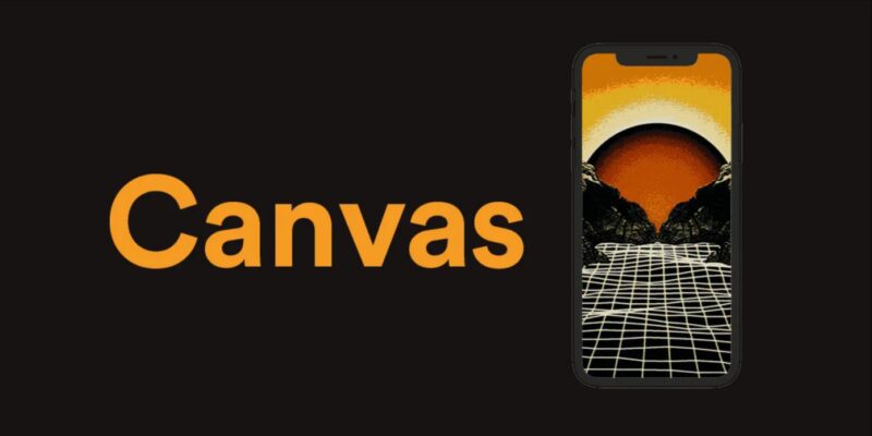
After a long period of beta testing, Spotify is now expanding the access to the highly anticipated Canvas feature to more artists. This feature allows artists to share animated visuals that are displayed when fans listen to their music in the Spotify mobile app.
But it’s not just about looking good. Spotify, always transparent with statistics, has demonstrated a clear difference between tracks that use the Canvas feature and those that don’t (source):
- Number of listeners who continued listening to the song increased by 5%
- Number of users who shared the track increased by a whopping 145%
- Number of listeners who chose to save the song to their playlists increased by 20%
10 tips to optimize your Spotify Canvas
1. Don’t try to sync the video with your song
The material you use doesn’t have audio and doesn’t sync with the music, so be careful when selecting your material. Having material that appears out of sync with the music can have a negative impact on listeners.
2. Don’t overwhelm your fans
Randomly cutting video clips is likely to overwhelm your fans. You only have 3-8 seconds to express yourself. One message that resonates is better than four that almost do.
3. Test how the clip will appear in the app
When uploading clips, you can test how they appear on devices like an iPhone X. Make sure not to have important elements in the part of the screen that is only visible there. Ensure that as many fans as possible can see what you want them to see. Once you’ve uploaded your Canvas, it’s a good idea to test how it looks on friends’ and acquaintances’ phones. Also, keep in mind that almost half of the lower part of your Canvas will be hidden under the playback controls (unless someone actively taps on the Canvas, in which case they will see the entire Canvas).
4. Don’t be overly obvious
When fans see your Canvas, they also see your artist name and song name, so you don’t need to take up extra space just to remind them of that. Instead, take the opportunity to tell more about the song or the feeling you want to convey!
5. Use different types of loop styles
Knowing how to utilize the loop effect will be beneficial when designing your Canvas. Here are the three most common styles:
- The continuous loop: A loop where you can’t notice when the clip starts over, very satisfying to watch as it seems like the clip just continues without a clear ending.
- The hard-cut loop: Here, it’s clear when the clip ends, which designers can use to their advantage – be creative!
- The bouncing loop: A clip that plays back and forth instead of repeating over and over again. This is a type of loop that Spotify has also seen captures the listener’s attention.
6. Tell a complete story
Telling a full story is challenging, but with your music, it’s not impossible. Use your Canvas to complement or develop the story that your music wants to tell. Only creativity sets the limits!
7. Have a consistent theme
Your artist page on Spotify already allows you to showcase images, write a biography about yourself, and other fun things. Canvas enables something entirely new – animated material. Take the opportunity to develop your visual presence in the Spotify app! One thing that will earn you many brownie points with fans is having a clear graphic profile throughout everything you do. Album covers, profile, cover image, social media images, and so on… Keep this in mind when designing your Canvas to radiate a clear identity.
8. Create a theme or story throughout an entire album
You could create completely different Canvases for each song on your album. Orrrrrr, you could create or enhance the common thread that runs through your songs. It can be a story (such as a recurring person or activity in each song’s Canvas) or simply having a consistent theme (e.g., a specific place or color present in each song’s Canvas).
9. Don’t be afraid to update
Updating your Canvas is very easy – a quick edit on your phone, and suddenly you have a new clip. This can be a way to communicate with your fans, develop the songs, or keep your visual profile up to date. Billie Eilish is a great example. As a tribute to her fans, she updates her songs with fan art animations created by her fans. Cool, right?! Don’t be afraid to experiment!
10. Keep your music relevant
In the same way that you can have a consistent visual profile or connection between songs on an album, you can use your Canvas to match what is currently relevant. Maybe you want to have a Pride-inspired catalog of Canvases during June or snowflakes during December? You decide!
Would you like to bounce ideas?
If you, like many others, feel that you need help with this, please don’t hesitate to contact us. We assist new and established artists with everything from songwriting and recording to distribution, marketing, and graphic profiling. Get in touch today for more information.
Would you like to read more about the steps before releasing music on Spotify? Read our guide “6 Steps to Releasing a Single”.
Guides
What is a clipper?
Have you started out in the world of mixing and mastering and just came across [...]
5 Clippers taking your mix to new heights
Are you not sure what Clipper to use when mixing and mastering your music? We [...]
Mastering Vocal Harmonies
Read more about what strategies you could use to learn more about, and eventually master, [...]
Export master files from Atmos projects in Logic Pro
This article gives you detailed information on how to export master files from Logic Pro [...]
Contact Us

CONTACT US
OUR PORTFOLIO
Over the past few years, KMR Studios has released hundreds of songs by a wide range of artists. To make it easier for you to find what you’re looking for, we’ve organized the music into various playlists. Click the link below to explore our music by format (stereo or Dolby Atmos) or genre.
Portfolio
 Svenska


